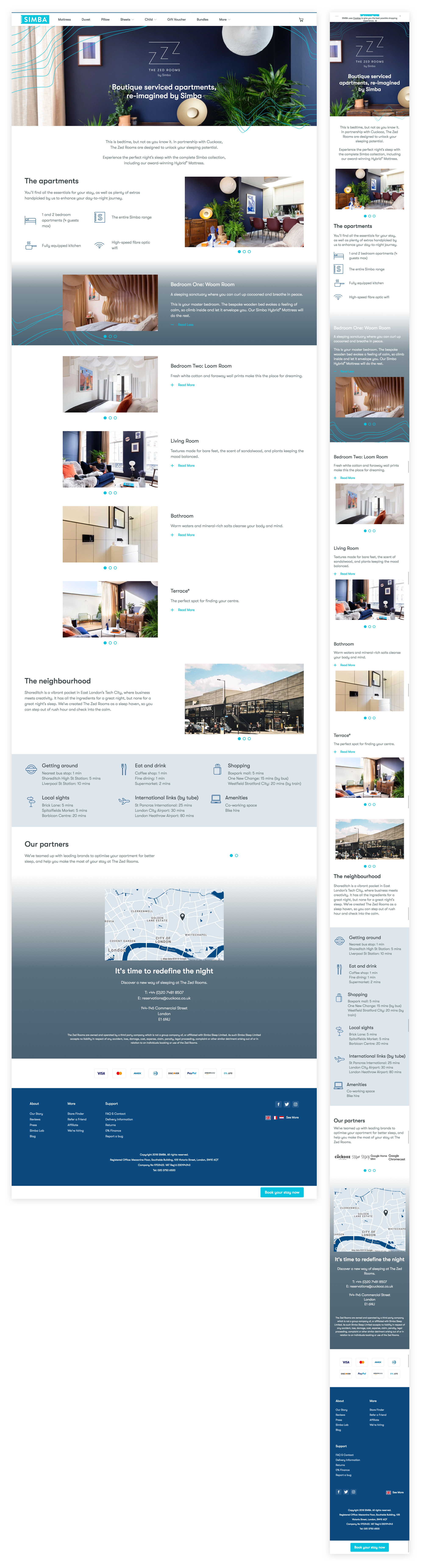
The Zed Rooms is a collaboration between Simba Sleep and Cuckooz and other secondary partners, including Lumie, Google Home and more. They consist of three apartments filled with innovations designed to give visitors an incredible night’s sleep. I was tasked with creating a landing page that would act as an informative primer to the apartments themselves and also drive clicks to the booking portal (externally hosted).
The landing page had to be informative yet not give away too much. Visually, it needed to utilize the Zed Room’s colour schemes and motifs, while incorporating a strong Simba identity as it was hosted on Simba Sleep’s site. It also need to convey how premium the apartments were, and position them as the unique experience they were. I executed both the UX and UI design of the page.
This page was shipped in time, and the live version can be found here! The Zed Rooms has so far been a huge commercial hit and has created many conversations around Simba and what we do as a company.
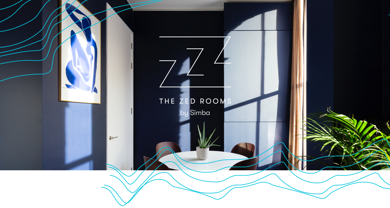
UX design
Click the image to see the full wireframes.
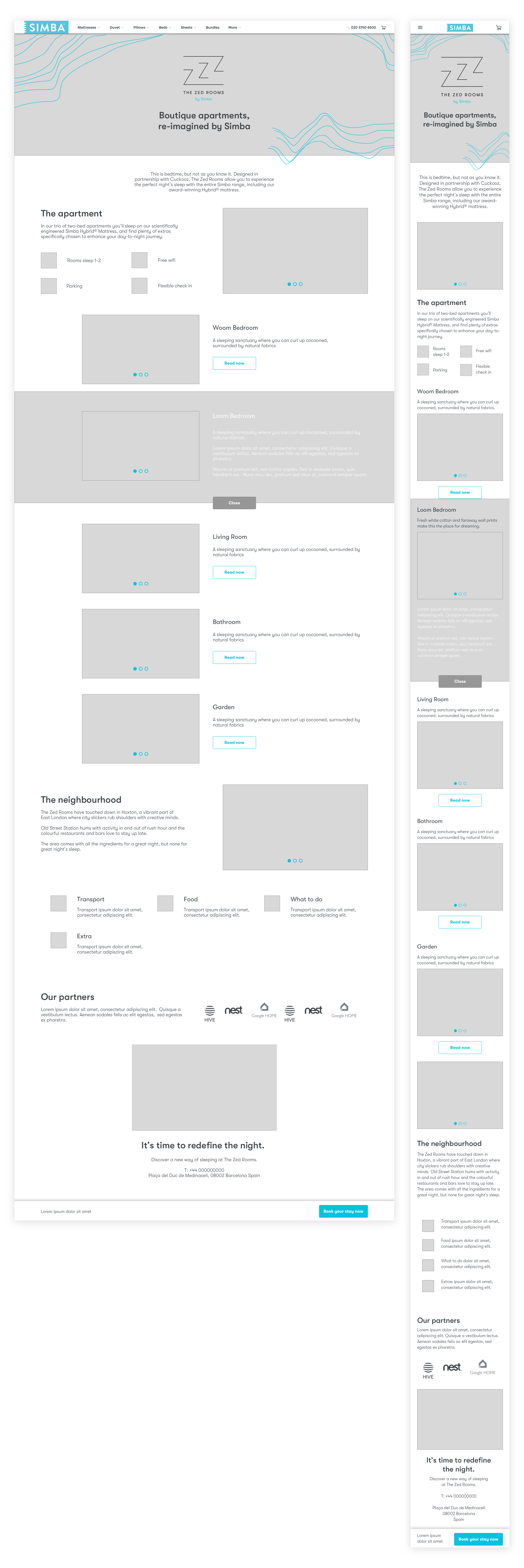
UI design
Click the image to see the full wireframes.